Mino’s Roast Beef: Menu Redesign & Logo Development
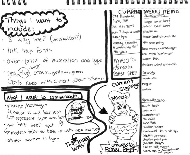
When I first moved to the North Shore, I started hearing about roast beef culture—a fiercely local tradition, complete with its own lingo (“three-way”) and loyal following. Lynn, MA, where Mino’s is located, sits at the heart of this food scene. It’s competitive, and customers here know their sandwiches. The more I learned about the history of Lynn and the North Shore beef rivalry, the more I realized that Mino’s was at risk of blending in. Their current branding was inconsistent, their menu was cluttered, and despite the personality of the shop, it didn’t stand out against dozens of well-established competitors.
The Problem:
Mino’s needed a visual identity and menu that would:
Capture the authentic North Shore beef tradition.
Make ordering quick and easy for take-out customers.
Position the restaurant as relevant and trendy without losing its diner-style charm.
The Solution:
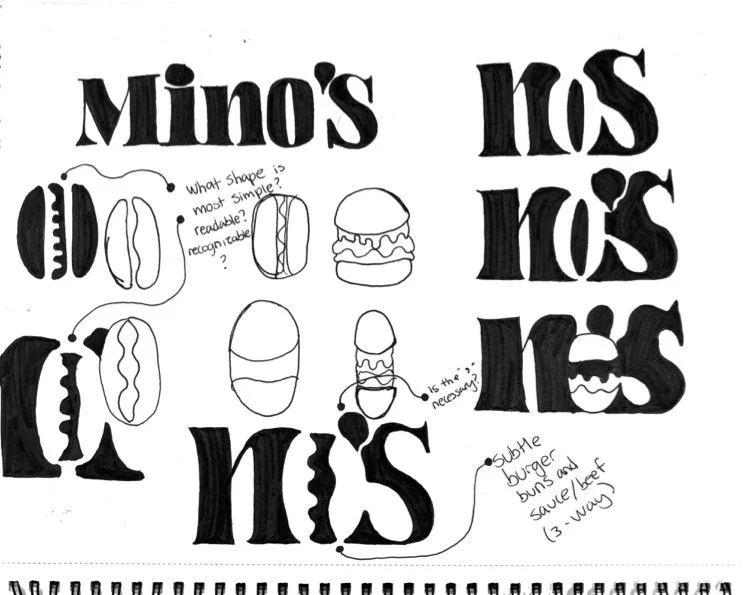
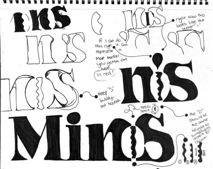
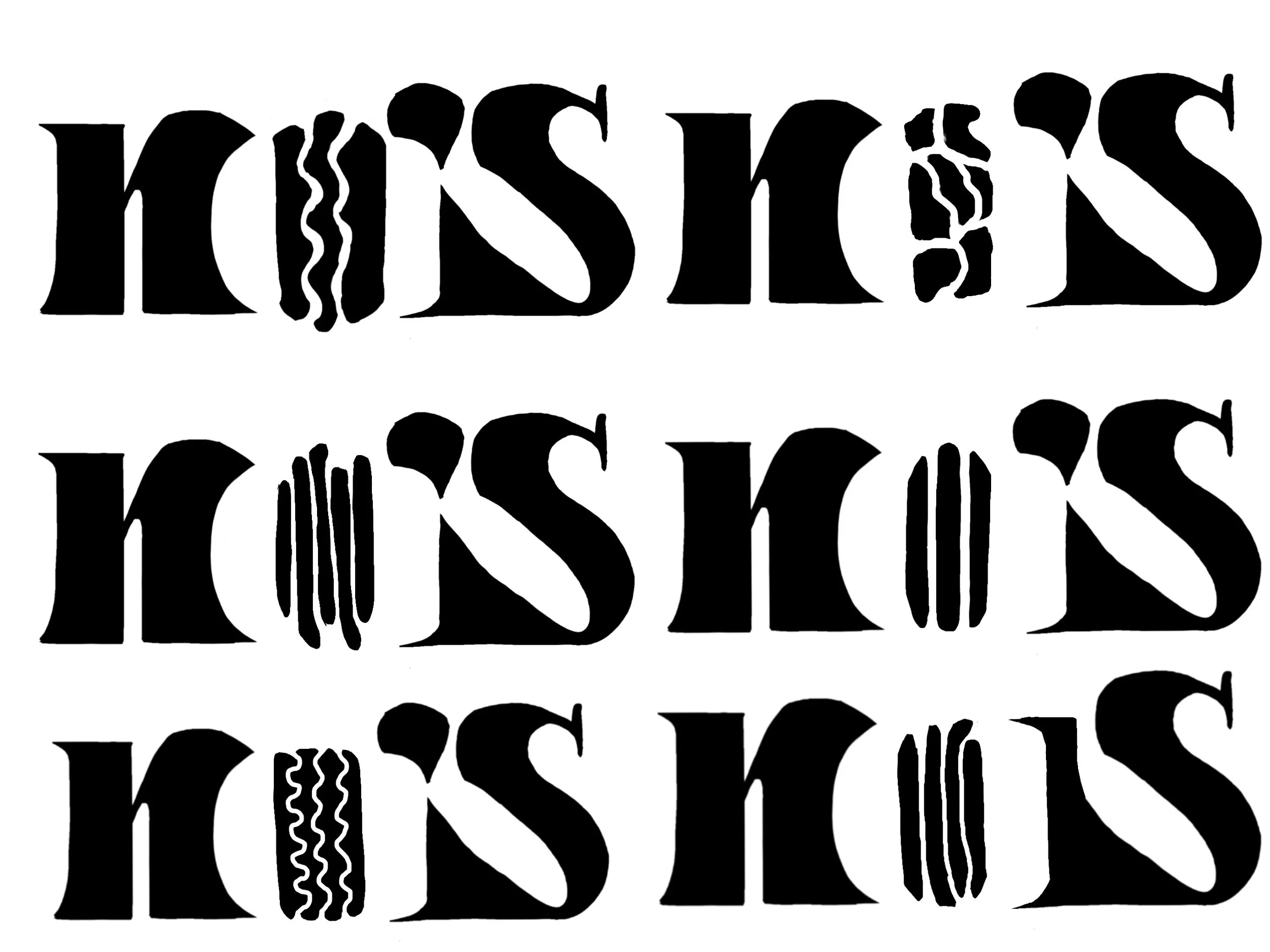
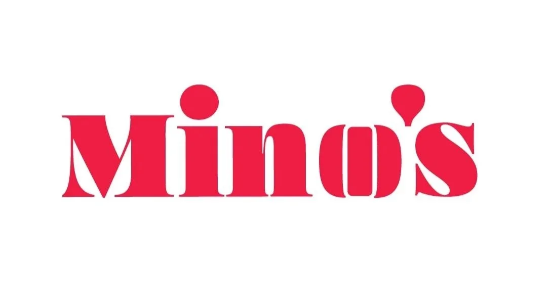
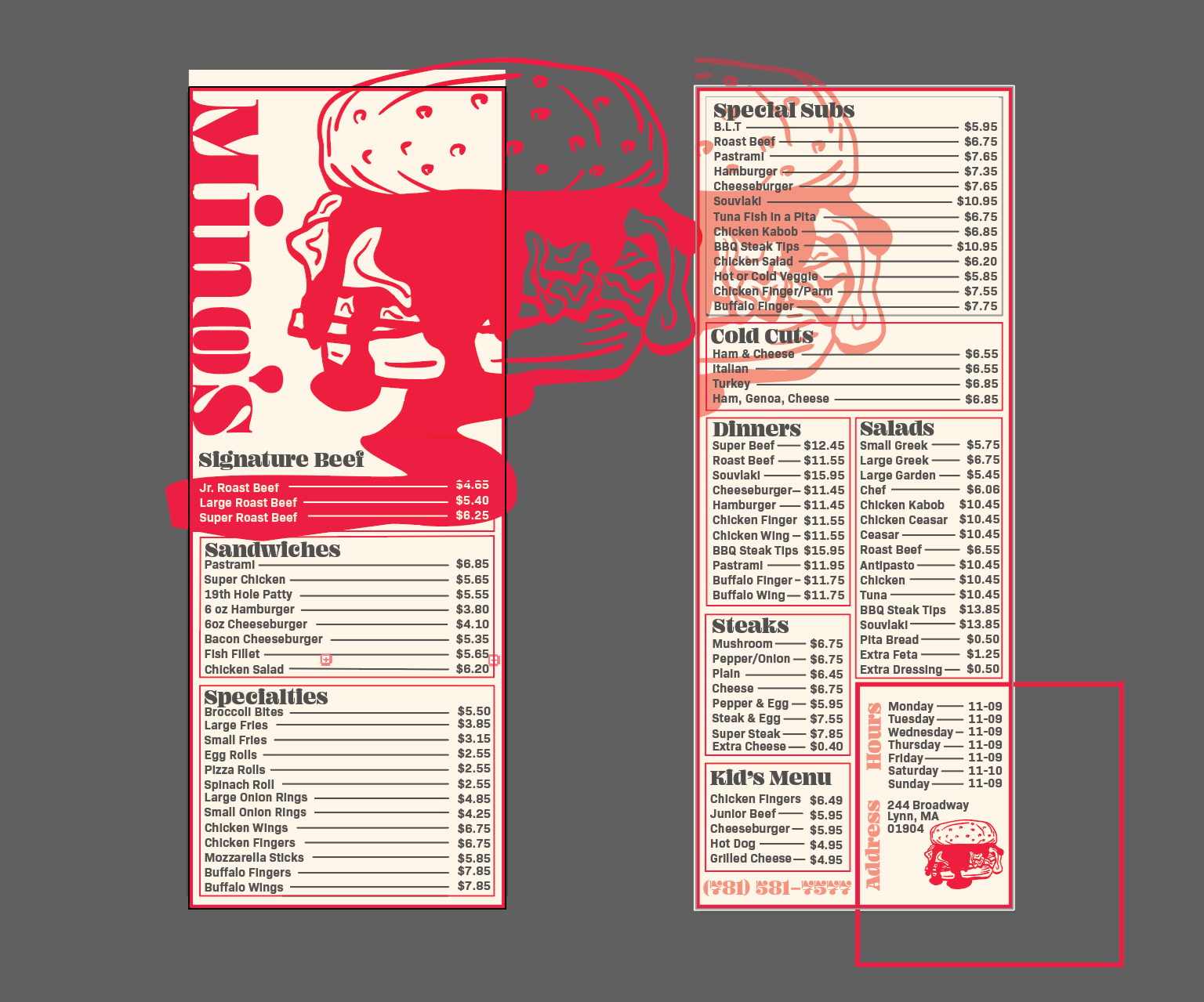
I began with research—immersing myself in the culture, studying competitors, and visiting Mino’s to get a feel for their vibe. I explored typography by hand, sketching the Mino’s name in ink until I found a form that balanced nostalgia with personality. The “O” became a subtle roast beef sandwich silhouette—an instant connection to their product.
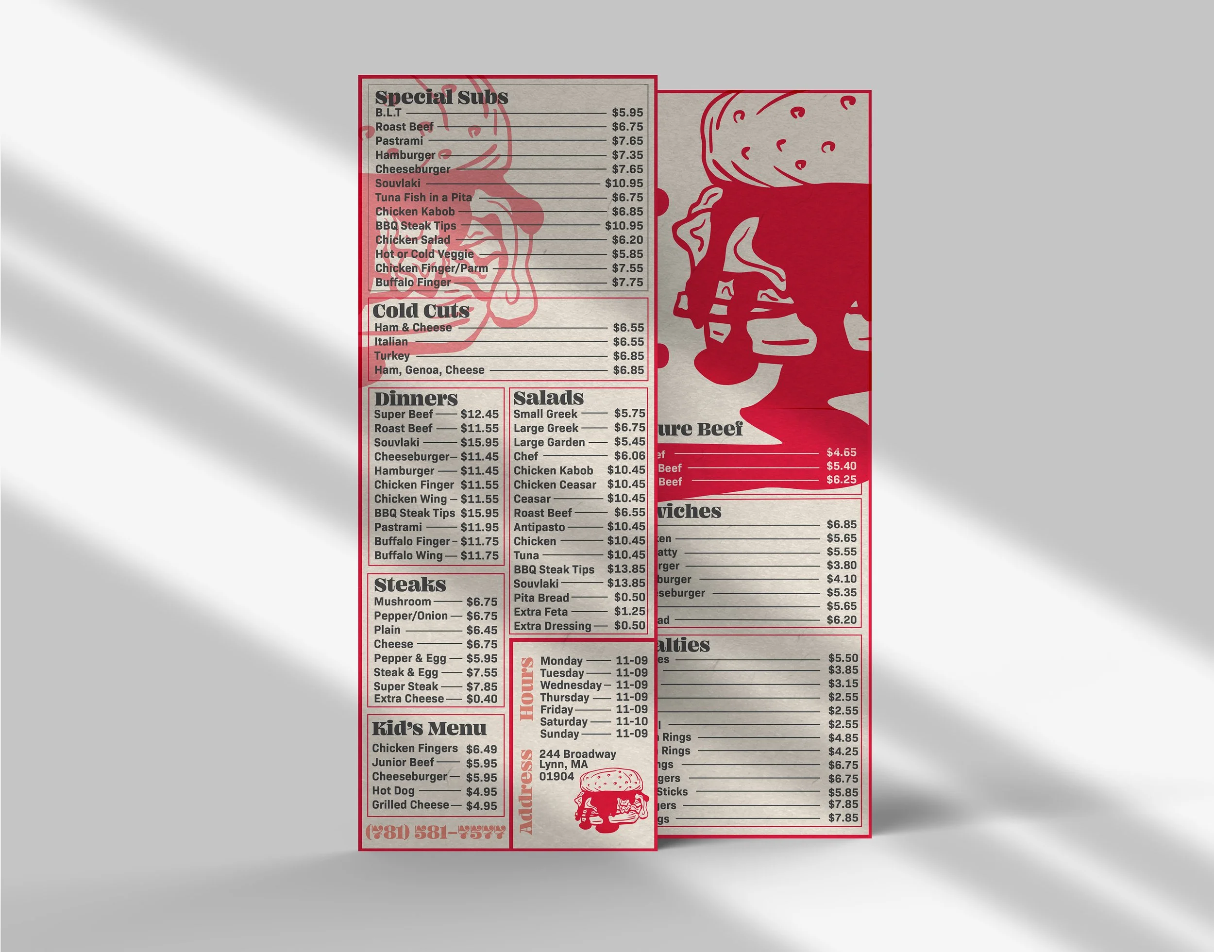
To create consistency, I designed a stylized roast beef illustration to accompany the logo. Both were drawn in Procreate, refined, and vectorized in Illustrator. The new double-sided menu, measuring 4.5" x 11" for easy take-out distribution, used careful font hierarchy and colour to organize a large menu into a clean, readable layout. Overprint effects and considered typography trends gave the final design a fresh-yet-familiar feel.
The Result:
The final branding gave Mino’s a distinctive, memorable look that set them apart in Lynn’s roast beef scene. It told customers they were part of the tradition, but also part of something current and worth talking about.