River Ridge: Outdoor Gear Brand Identity
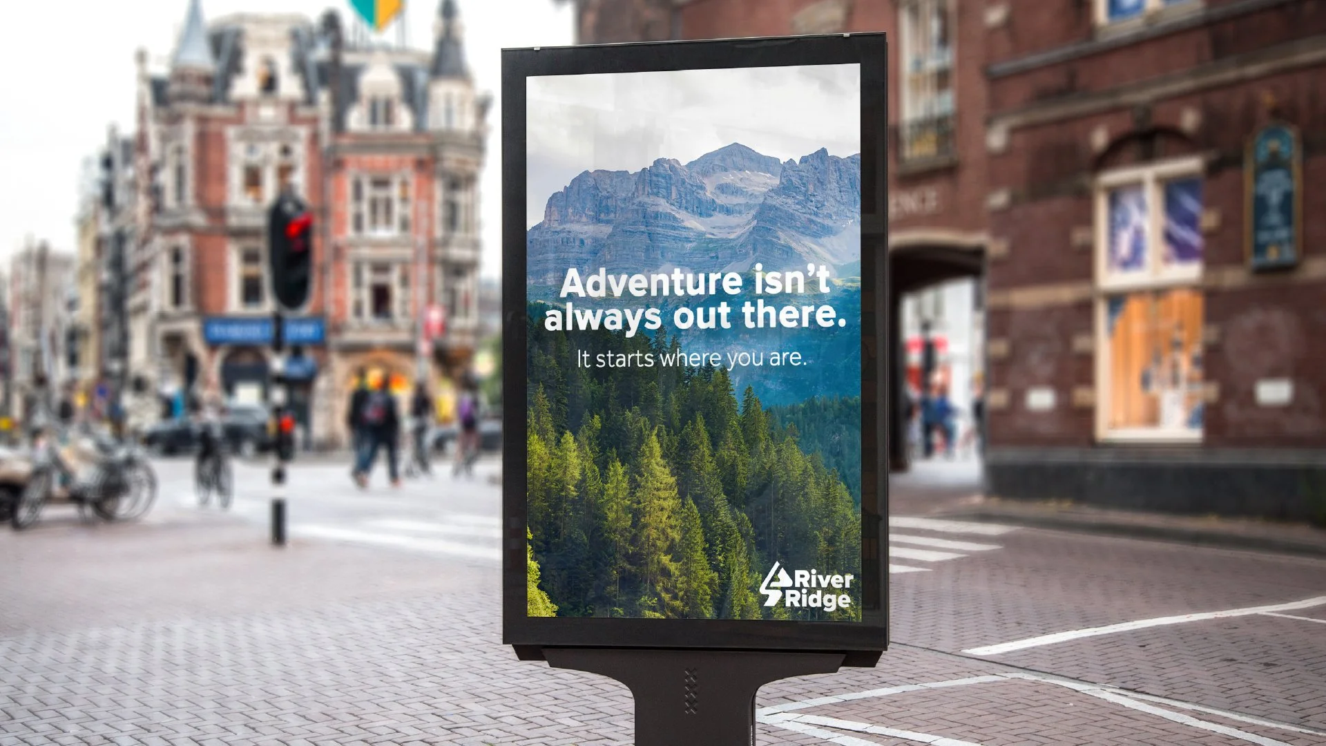
River Ridge is a conceptual brand identity project for an outdoor gear company that encourages everyday exploration. The goal was to create a visual system that is approachable, professional, and adaptable—speaking to both new and seasoned adventurers. This included designing a logo, wordmark, colour palette, type system, mockups, and brand collateral.
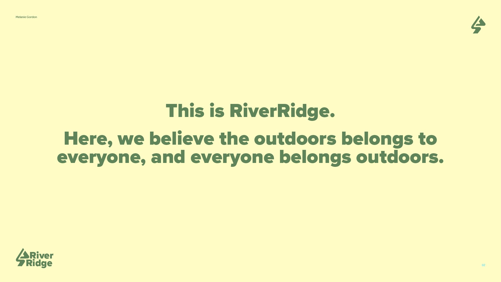
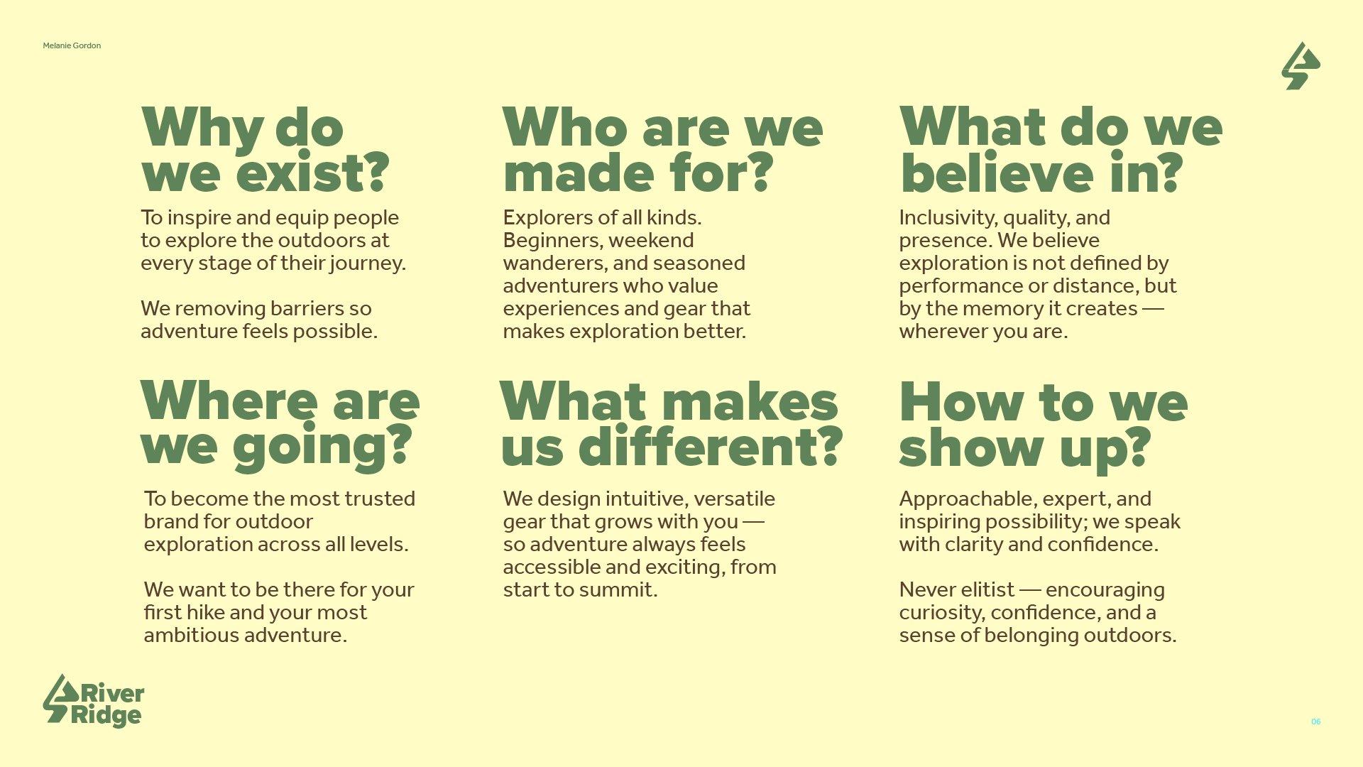
In the outdoor gear space, many brands lean into extremes—high-performance, rugged, elite. But what about the people who explore closer to home, or those just starting out? I saw an opportunity to design a brand that felt grounded, human, and empowering without sacrificing professionalism.
The idea for River Ridge began with a question: Can a brand make the outdoors feel less intimidating, while still being aspirational? I imagined a brand that honors presence over performance—where adventure is not about how far you go, but how fully you experience it.
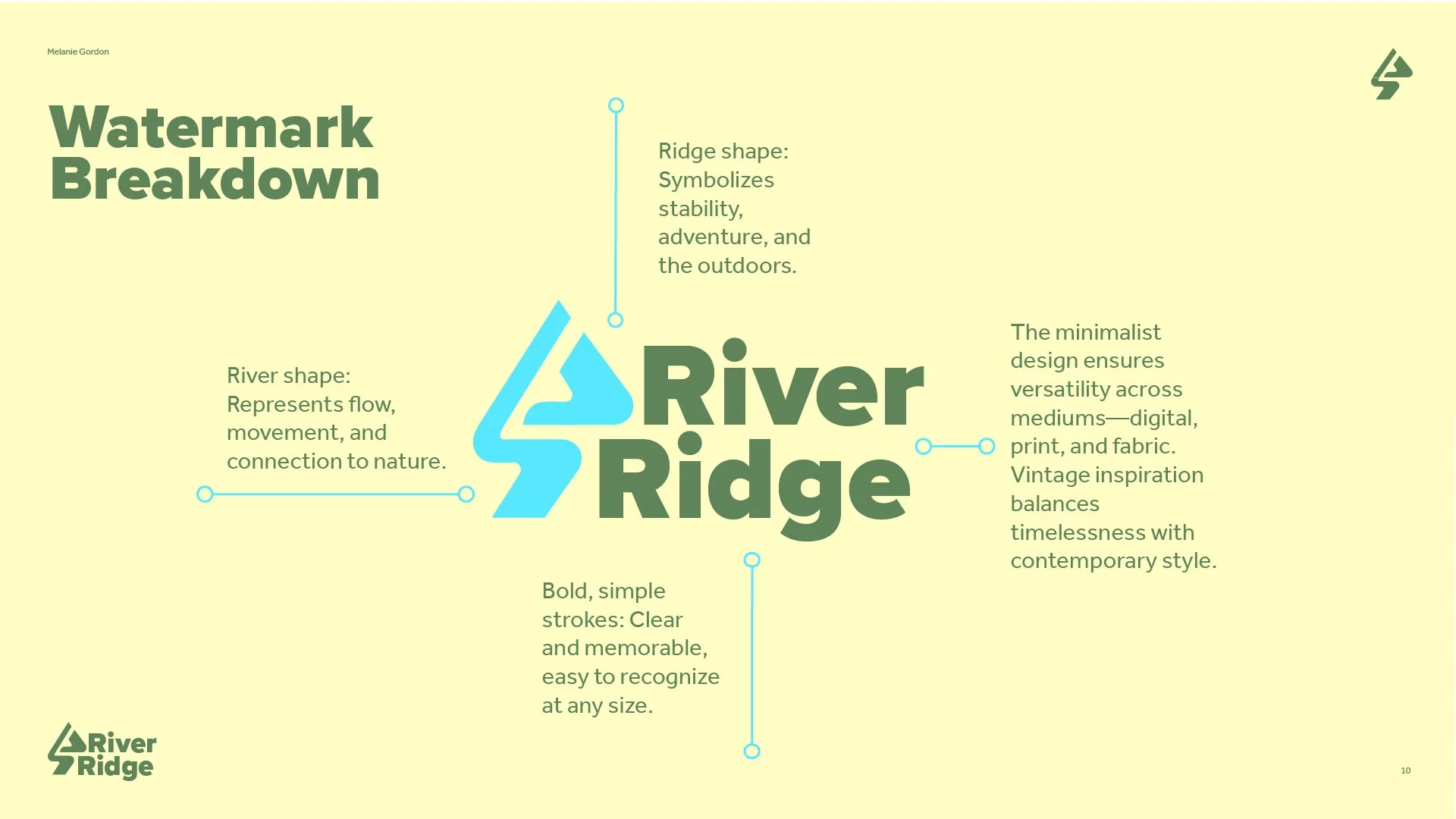
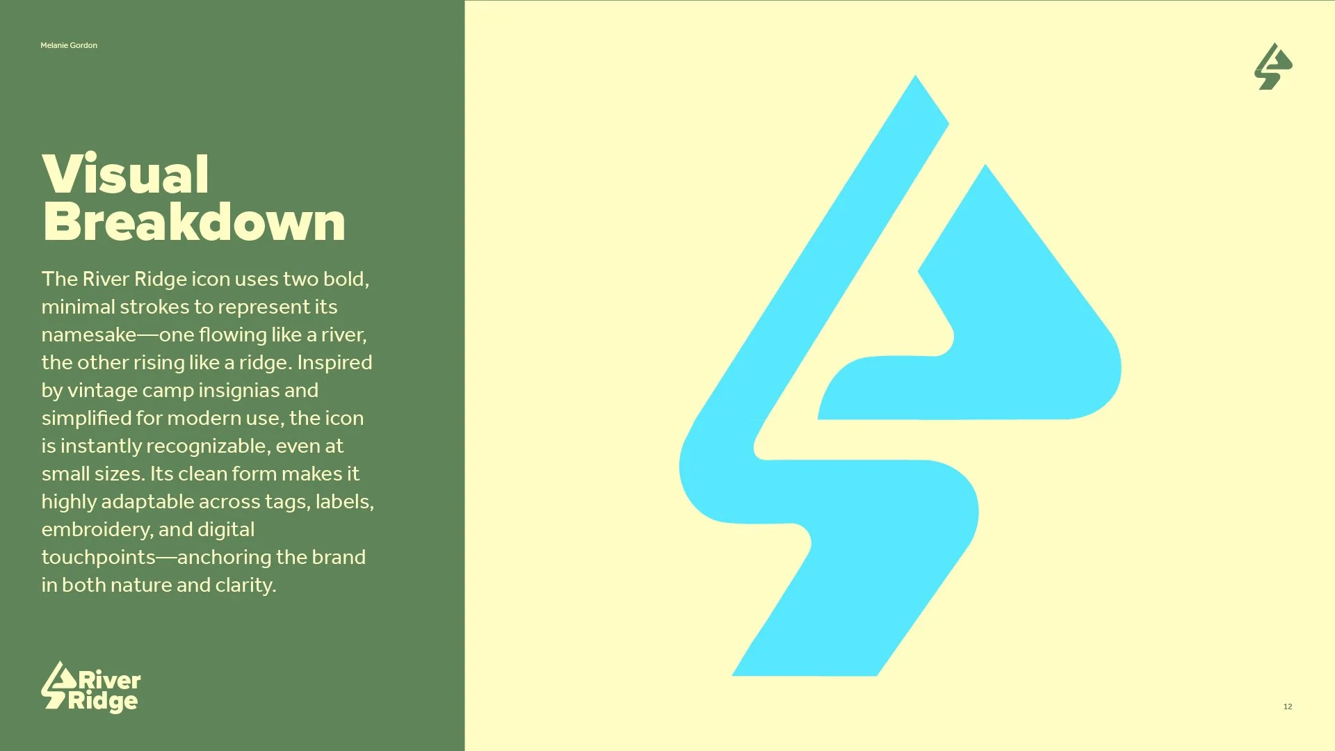
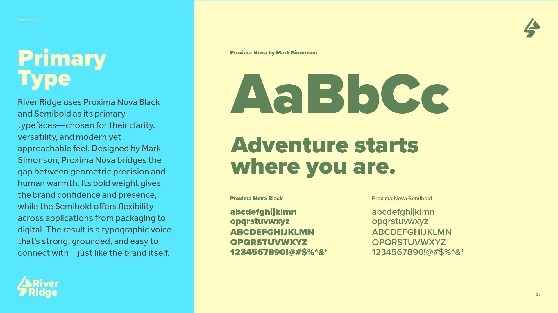
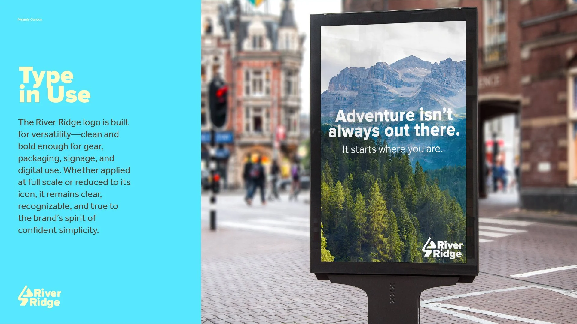
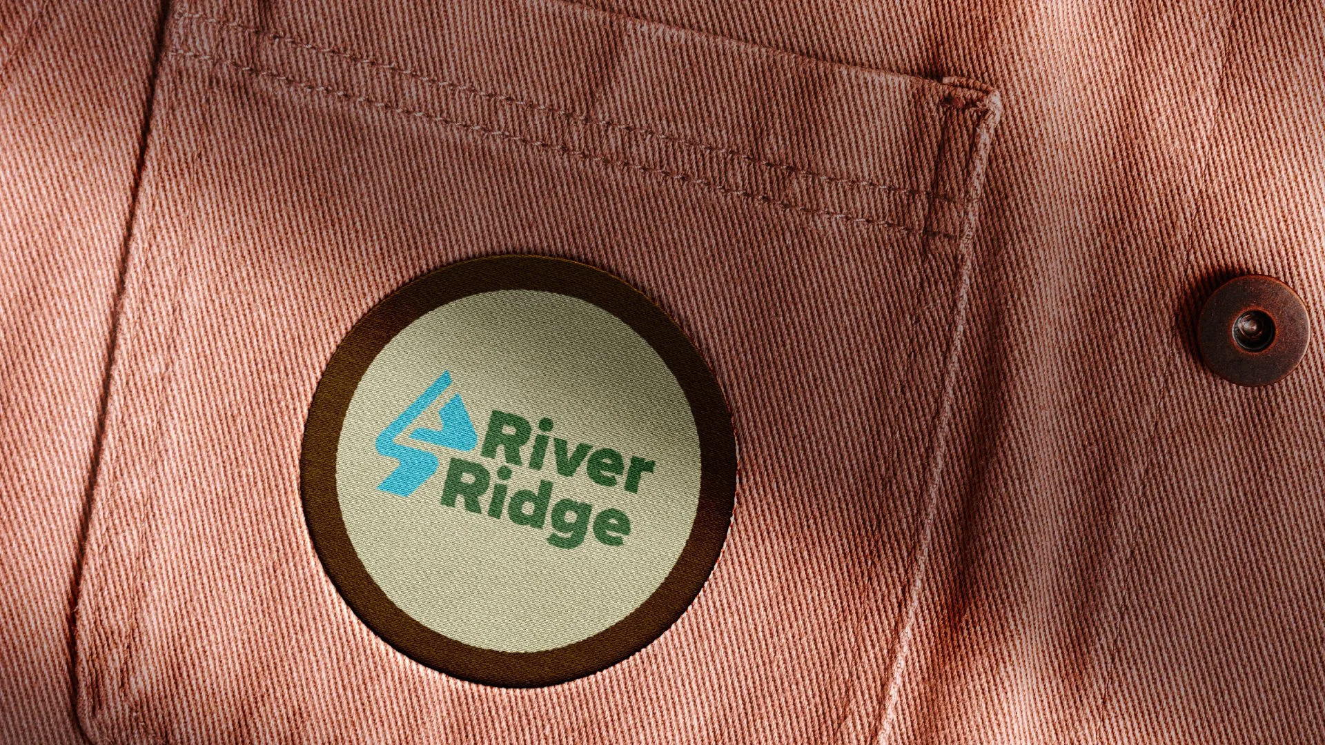
I started sketching simple, symbolic shapes that could reflect the brand’s name and values. The final icon—two bold strokes representing a river and a ridge—came from refining those early ideas into something modern, memorable, and versatile. From there, I built a visual system inspired by natural tones, vintage trail signage, and clean, accessible type.
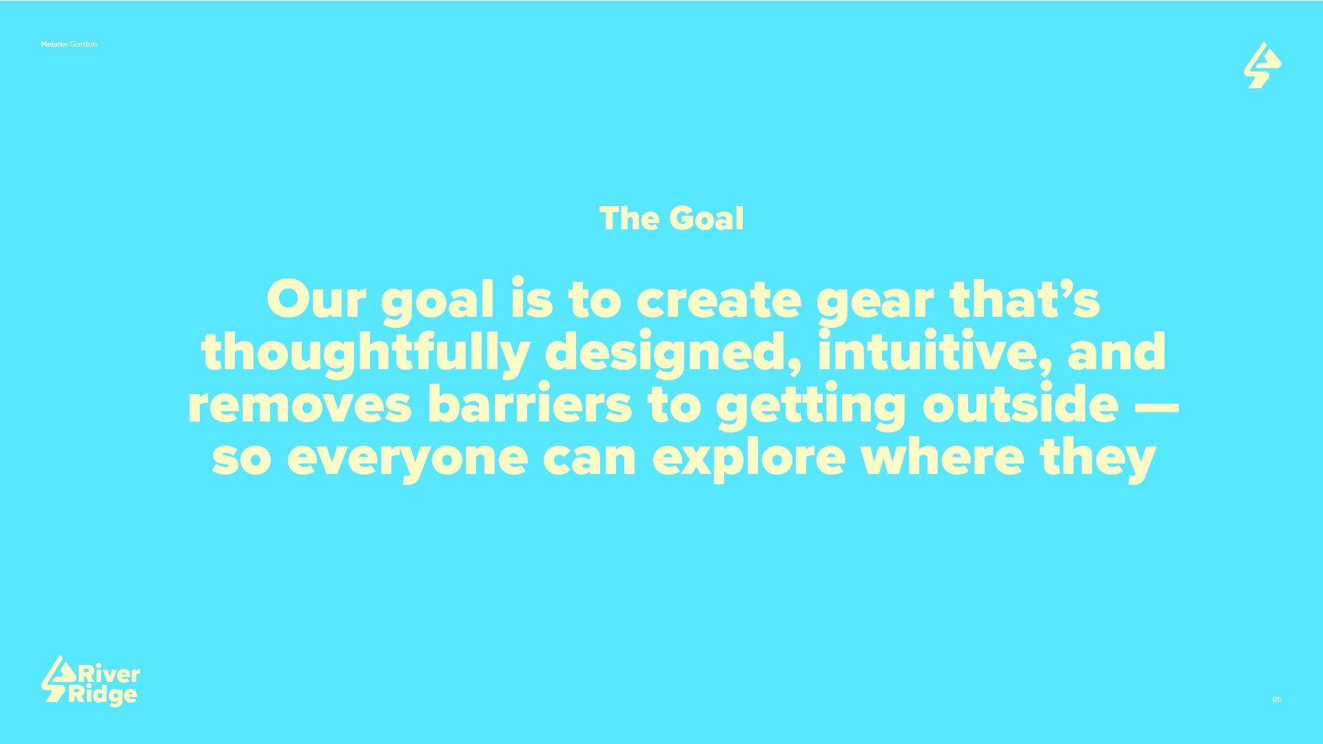
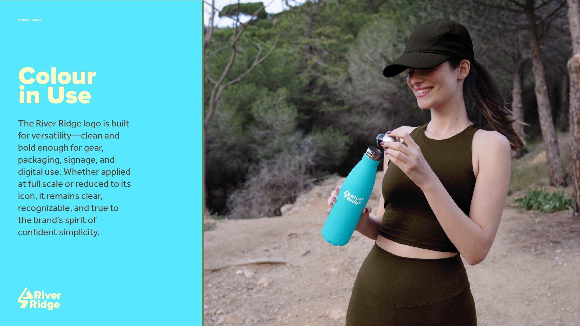
Throughout the process, I focused on clarity, consistency, and emotional connection—creating a brand that could live on everything from gear tags to digital ads, and most importantly, resonate with people at every point in their outdoor journey.
The Creative Process

-
![]()
-
![]()
-
![]()
-
![]()
-
![]()
-
![]()
-
![]()
-
![]()
-
![]()
-
![]()
New List Item
-
![]()
-
![]()
-
![]()
-
![]()
-
![]()
-
![]()
-
![]()
-
![]()
-
![]()
-
![]()
-
![]()
-
![]()
-
![]()
-
![]()
-
![]()
-
![]()
-
![]()
-
![]()